
A better way to add labels to bar charts with matplotlib
Lately, I’ve been using Python’s matplotlib plotting library to generate a lot of figures, such as, for instance, the bar charts I showed in this talk.
To improve readability, I like to put a number label at the top of each bar that gives the quantity that that bar represents. When I realized I wanted to add these labels to my charts, the first thing I did was look at this example from the matplotlib documentation, which seemed to be doing something a lot like what I wanted:

In the code that generates this figure, this little autolabel function is responsible for putting labels on the bars:
def autolabel(rects):
    # attach some text labels
    for rect in rects:
        height = rect.get_height()
        ax.text(rect.get_x() + rect.get_width()/2., 1.05*height,
                '%d' % int(height),
                ha='center', va='bottom')

autolabel(rects1)
autolabel(rects2)
The autolabel function expects its rects argument to be a container that can be iterated over to get each of the bars of a bar plot. (Conveniently, the bar method returns such a container.)
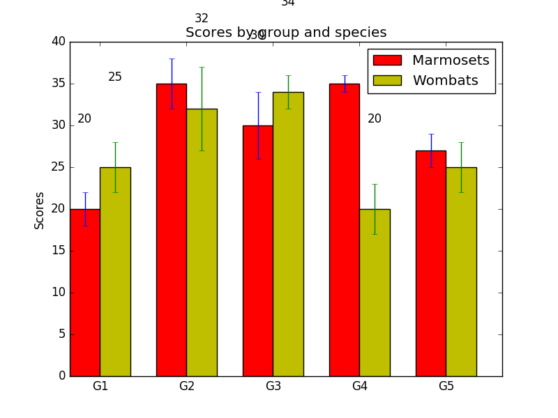
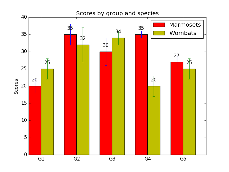
autolabel was a good start for what I wanted to do, but unfortunately, it isn’t very robust. In the above figure, each column represents a number between 20 and 35:
marmosetsMeans = (20, 35, 30, 35, 27)
wombatsMeans = (25, 32, 34, 20, 25)
But what if we try to use the same code with some different data?
marmosetsMeans = (860, 670, 1145, 1250, 15)
wombatsMeans = (870, 749, 1300, 910, 10)
Here’s what the plot looks like now:
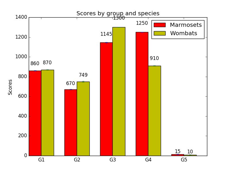
Oh, dear. Now we’ve got ‘1300’, and to a lesser extent ‘1250’ and ‘1145’, just hanging out up there in space. Meanwhile, ‘15’ and ‘10’ are crowding the columns that they’re supposed to be above. How did that happen?
Looking again at autolabel, we see that it uses the expression 1.05*height to determine where to put the text label that goes with a given rectangle of height height. So, autolabel is multiplying the rectangle’s height by a small number, and the result is the height of the gap from the top of the column to where the text appears.
If height varies more than a little from bar to bar, then multiplying that small number and height will produce gaps of awkwardly varying size. It’s only the fact that the bar heights in the original example only vary from 20 to 35 that stop it from looking terrible. In fact, now having realized that the gap sizes depend on the data, we can see it there, too: the gap between ‘20’ and the top of its column is noticeably smaller than the gap just below ‘35’. That’s no good.
First attempt at a fix: add, don’t multiply
One way to fix this would be to add a suitable number to the column height, instead of multiplying, and use the result to determine where to put the label text. That is, instead of writing 1.05*height, we can write height + 10, or something like that. Indeed, people who answer questions about such things on Stack Overflow have already arrived at this solution. Using height + 10 in our own code, we get:

Alas, this approach isn’t robust, either. This is what it looks like when we try to go back and plot our original data:
Oh, no! Now our gaps, although all the same size, are way too big. Most of the labels are actually off the chart. In order to get this right, we’d have to change height + 10 to something smaller that would look nice with this data, like height + 1:
That’s better. But having to pick a different number for every figure we plan to generate sounds about as fun as cleaning up my cat’s puke. Is there an approach to label placement that will work regardless of what the data looks like?
A more robust fix: scale according to the height of the axis
Why does adding a constant like 10 to height not work the way we want it to? The problem is that height is not in units of centimeters, or furlongs, or any unit of distance that would be consistent from one figure to the next; it’s in “axis points”, the same units as the actual data being plotted! For instance, the bar furthest to the left in the plot of our first set of data is 20 axis points tall, while the leftmost bar in the plot of our second set of data is 860 axis points tall. A gap of height 10 next to a column of height 20 is different from a gap of height 10 next to a column of height 860.
What we really want is to scale the height of the label gaps to whatever is reasonable for our figure. The trick to doing this is to look at the height – given in axis points – of the y-axis of the plot. For instance, with our first set of data, the range of the y-axis is [0, 40], so it has a height of 40 axis points, while in the second set, the y-axis range is [0, 1400], so, a height of 1400 axis points. If we can find out what the height of the y-axis is in axis points, we can have the label gaps be a fixed fraction of that height. We still have to decide what that fraction will be – but we only have to do that once, and then we’ll have proportionally-sized gaps in every figure we generate.
To do this, we can call matplotlib’s get_ylim method on an Axes object to get the y-axis range. In the case of our example code, we even already have an Axes object, called ax, which we can pass to autolabel. Then, we can find out the height of the y-axis by subtracting the bottom of its range from the top of its range, and finally, we can position the label above each bar at a height in proportion with the y-axis height.
Here’s what the revised code looks like, where I’ve chosen 0.01 as the number to multiply the axis height by.
def autolabel(rects, ax):
    # Get y-axis height to calculate label position from.
    (y_bottom, y_top) = ax.get_ylim()
    y_height = y_top - y_bottom

    for rect in rects:
        height = rect.get_height()
        label_position = height + (y_height * 0.01)

        ax.text(rect.get_x() + rect.get_width()/2., label_position,
                '%d' % int(height),
                ha='center', va='bottom')

autolabel(rects1, ax)
autolabel(rects2, ax)
Choosing 0.01 will give us gaps of 0.4 axis points for our first set of data, and 14 axis points for our second set. Here’s what it looks like when we plot the first data set:

And the second:

Much better!
One more thing
There’s also one last refinement that I made for my own plotting. As we saw above, sometimes bar labels run over the top edge of the figure, and it can happen even if we’re using our axis-height-based approach. For example, if we change ‘1300’ to ‘1350’ in the data, the above plot turns into this:
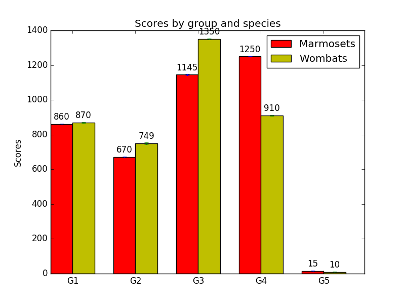
Not so nice. But we can have autolabel handle this situation as well. For each bar, we can determine how much of the axis height it takes up. If the bar takes up almost all the height, say, 95% or more of it, we can choose to put the label inside the bar instead of above it. We just position the label at a certain distance below the top of the bar (again, proportional to the y-axis height), instead of above it. The exact percentage of the height we pick is a matter of what looks good, as is the y-axis height multiplier we use; in the code below, I picked 95% and 0.05 for these after some fiddling. But, again, you only have to set these once, and then they’ll work for every plot you do.
def autolabel(rects, ax):
    # Get y-axis height to calculate label position from.
    (y_bottom, y_top) = ax.get_ylim()
    y_height = y_top - y_bottom

    for rect in rects:
        height = rect.get_height()

        # Fraction of axis height taken up by this rectangle
        p_height = (height / y_height)

        # If we can fit the label above the column, do that;
        # otherwise, put it inside the column.
        if p_height > 0.95: # arbitrary; 95% looked good to me.
            label_position = height - (y_height * 0.05)
        else:
            label_position = height + (y_height * 0.01)

        ax.text(rect.get_x() + rect.get_width()/2., label_position,
                '%d' % int(height),
                ha='center', va='bottom')

autolabel(rects1, ax)
autolabel(rects2, ax)
Now our plot looks like this:

And that’s it! It’s also possible to have the labels go inside the bars by default, except in cases where the bars are too short to accommodate them, and that’s an easy change to the above code, left as an exercise to the reader.
Another, more challenging exercise for the reader is dealing with the situation where the y-axis uses a log scale. I have a hacky solution for this, but it’s not very robust. A version of autolabel general enough to accommodate either a logarithmic-scale or linear-scale y-axis would be great!
Comments