
Understanding the regression line with standard units
This post has an accompanying Jupyter Notebook! How do you do, fellow kids?
Over the last few months, I’ve been working my way through Data 8X, the online version of Berkeley’s Data 8 course, after seeing Joe Hellerstein tweet about it a while back. At first, I was interested mostly for pedagogical reasons, but I can now admit to actually having learned something about data science, too. The course is organized in three parts, and I’ve finished the first two parts (check out my cheevos!) and am working my way through the third part, which focuses on prediction and machine learning.
A few days ago, I came to the part of the course that discusses the equation of the regression line, which is, well, the line used in linear regression. Given two variables \(x\) and \(y\), which we can visualize as a two-dimensional scatter plot of a bunch of points, the idea of linear regression is to find the straight line that best fits those points. Once we have such a line, we can use it to predict the value of \(y\), given some new value of \(x\). The regression line represents the linear function that minimizes the error of those predictions for all the \((x, y)\) pairs that we know about.1
The course gives a delightfully simple equation for the regression line: it’s \(y = r \times x\), where \(r\) is the correlation coefficient of \(x\) and \(y\), and \(x\) and \(y\) are measured in standard units. I had been familiar with the concept of linear regression before taking the course, but standard units and the correlation coefficient were new to me. As it turns out, working with standard units and the correlation coefficient makes linear regression easy!
As an example, let’s use some Small Data that I have handy: the measurements of my daughter’s height (or length, if you like) and weight that were taken at doctor visits during the first year of her life. The first measurements were taken on July 28, 2017, a few days after she was born, with further measurements taken at the follow-up appointments at two weeks, one month, two months, four months, six months, nine months, and twelve months.2
| Date | Height (cm) | Weight (kg) |
|---|---|---|
| 2017-07-28 | 53.3 | 4.204 |
| 2017-08-07 | 54.6 | 4.65 |
| 2017-08-25 | 55.9 | 5.425 |
| 2017-09-25 | 61 | 6.41 |
| 2017-11-28 | 63.5 | 7.985 |
| 2018-01-26 | 67.3 | 9.125 |
| 2018-04-27 | 71.1 | 10.39 |
| 2018-07-30 | 74.9 | 10.785 |
Leaving aside the date column for now, we can plot weight as a function of height:
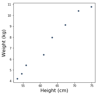
Those dots look awfully close to being a straight line! It seems like linear regression might be a good choice for modeling the relationship between Sylvia’s height and weight during this time period. But before we get to that, let’s talk about standard units.
Converting to standard units
Consider a data point like, say, 61 centimeters, which was Sylvia’s height on September 25, 2017. Expressing this data point in units of centimeters is useful: for one thing, it’s not too hard for us, as humans, to imagine more or less how long that is. If we’ve been around a lot of babies, we might even know enough to say, “Wow, that’s a big two-month-old.”
In other ways, though, it’s perhaps less useful. If we just see the data point “61 centimeters” by itself, we don’t know anything about how it relates to the rest of the numbers in the height column: is it shorter, longer, or about average? We’d have to see the rest of the data set in order to answer that question. But it turns out that there is a way to represent individual data points that will let us answer such a question without having to look at the rest of the data set! That representation is standard units.3
To convert a data point to standard units, you need to know three things: its value in original units (centimeters, petaflops, whatever it is you’ve got), and the mean and the standard deviation of the data set it came from. Its value in standard units is how many standard deviations above the mean it is.4 So, if a value is exactly average in the data set it came from, then regardless of what “average” means for that data set, when converted to standard units, it’s zero. If it’s one standard deviation above average, then in standard units, it’s one. If it’s below average, then in standard units it will be negative. You get the idea.
Here’s that same table again, but with the heights and weights converted to standard units.
| Date | Height (standard units) | Weight (standard units) |
|---|---|---|
| 2017-07-28 | -1.26135 | -1.3158 |
| 2017-08-07 | -1.08691 | -1.13054 |
| 2017-08-25 | -0.912464 | -0.808628 |
| 2017-09-25 | -0.228116 | -0.399485 |
| 2017-11-28 | 0.107349 | 0.254728 |
| 2018-01-26 | 0.617255 | 0.728253 |
| 2018-04-27 | 1.12716 | 1.2537 |
| 2018-07-30 | 1.63707 | 1.41777 |
Height and weight are now what a statistician would call standardized variables. Sylvia’s height on September 25, 2017 was -0.228116 standard units. From that number, we can tell that that day is just a bit below average for this data set; in particular, it was around 0.2 standard deviations below average. We did have to look at the rest of the data set to be able to come up with the number -0.228116 in the first place, but the information we got from doing that is now implicit in the value itself. So, if you asked me how tall Sylvia was at her two-month checkup and I told you, “Oh, about negative point-two standard units,” you’ll know that she was taller at other, presumably later, times.
Admittedly, that information isn’t all that interesting to have. After all, we expect most babies to get taller as time goes by. It might be more interesting to use standard units for a different data set, such as, say, the heights of a large number of two-month-old babies. Then, knowing the height of any one of those babies in standard units would tell us how its height compared to the rest of the babies in the data set. But, as we’ll see in a moment, standard units are good for more than just quickly seeing how a particular data point compares to the average.
To start with, let’s see what happens if we plot weight as a function of height, like we did before, but now with the the data in standard units:
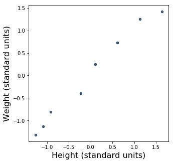
This scatter plot looks pretty familiar. In fact, the data points look exactly the same as they did above, when we were working with centimeters and kilograms! Indeed, the data hasn’t changed: all that’s changed is the axes.
We can see that the origin, \((0, 0)\), is now in the middle of the plot. Because we’re using standard units, \((0, 0)\) is the “point of averages”, or the point where both variables are at their average values. You may already know that in linear regression, the regression line for a particular data set always passes through the “point of averages” for that data set. In other words, if you plug the exact average value of \(x\) into the regression equation, the \(y\) you’ll get will be the exact average value of \(y\). So, since 0 means “average” in standard units, when we’re working in standard units we know right away that the regression line always goes through \((0, 0)\). How convenient! That’s one reason why that \(y = r \times x\) equation up there is so simple. There’s no need to specify a \(y\)-intercept, because when \(x\) and \(y\) are in standard units, the \(y\)-intercept of the regression line is always 0.
So, now all we need is \(r\), and then we can draw the regression line. But just what is this \(r\) thing?
The correlation coefficient
The correlation coefficient, known as \(r\), is a measure of the strength of the linear relationship between two variables. If we represent that relationship as a scatter plot, then \(r\) is a measure of how close the points are to being on a straight line. A positive \(r\) means there’s a direct linear relationship between the variables; the highest possible \(r\) is 1, which means that all the points are on a straight line with positive slope. A negative \(r\) means there’s an inverse linear relationship, with the lowest possible \(r\) being -1, meaning that all the points are on a straight line with negative slope. An \(r\) of 0 means there’s no linear relationship, which could mean that there’s no relationship at all, or that the two variables are related in some non-linear way. Wikipedia has several examples of scatter plots with different values of \(r\).
The correlation coefficient is fascinating! Two quantitiative psychologists, Joseph Lee Rodgers and W. Alan Nicewander, wrote a well-known paper called “Thirteen Ways to Look at the Correlation Coefficient” that explores some of the many ways to think about \(r\). For our purposes, we’re thinking of it as the slope of the regression line for the relationship between two variables in standard units. This way of interpreting \(r\) happens to be number three on Rodgers and Nicewander’s list: “Correlation as Standardized Slope of the Regression Line”.
How do we compute \(r\)? For that, we can turn to number six on Rodgers and Nicewander’s list: “Correlation as the Mean Cross-Product of Standardized Variables”! Not only is \(r\) the slope of the regression line for the relationship between two variables in standard units, it’s also the average cross product of the values of two variables in standard units.
So, since we’ve already converted our height and weight to standard units, all we have to do to find the slope of the regression line is multiply all our paired-up values of \(x\) and \(y\) with each other, and then take the average of those products. And since we already know that the \(y\)-intercept is 0, then we can draw the regression line! That’s it! No dimly-remembered calculus! No ugly iterative methods!
Let’s add a new column to our table from before, where we’ll write down the product of each pair of standardized height and weight values:
| Date | Height (standard units) | Weight (standard units) | Product of standardized height and weight |
|---|---|---|---|
| 2017-07-28 | -1.26135 | -1.3158 | 1.65968 |
| 2017-08-07 | -1.08691 | -1.13054 | 1.22879 |
| 2017-08-25 | -0.912464 | -0.808628 | 0.737844 |
| 2017-09-25 | -0.228116 | -0.399485 | 0.091129 |
| 2017-11-28 | 0.107349 | 0.254728 | 0.0273447 |
| 2018-01-26 | 0.617255 | 0.728253 | 0.449518 |
| 2018-04-27 | 1.12716 | 1.2537 | 1.41312 |
| 2018-07-30 | 1.63707 | 1.41777 | 2.32099 |
And now we can just take the average of the numbers in that last column to get \(r\). Before we do that, though, let’s try to get some intuition for why it makes any sense to multiply height and weight together when they’re in standard units, and why the average of those products would give us \(r\).
Well, we said before that a positive \(r\) means that there’s a direct linear relationship between our two variables, and a negative \(r\) means that there’s an inverse linear relationship. Looking at our table, we can see right away that all of the numbers in the last column are positive, because in each case, we got the number either by multiplying two negative numbers or two positive numbers. That happened because each of our values in the height column falls on the same side of average – that is, on the same side of zero – as the corresponding value in the weight column.
If all our above-average heights had corresponding below-average weights, and vice versa, then the products in the last column would all be negative, and so \(r\), the average of the products, would also be negative, indicating an inverse linear relationship. And if some of the above-average heights corresponded to above-average weights and some corresponded to below-average ones, and the same for the below-average heights, then we’d have a mix of positive and negative numbers in the last column, and so the average of that column would presumably be pretty close to 0 – indicating a weak linear relationship or none at all. Hopefully, this informal line of reasoning provides some intuition about why taking the average cross-product of two standardized variables gives you \(r\).5
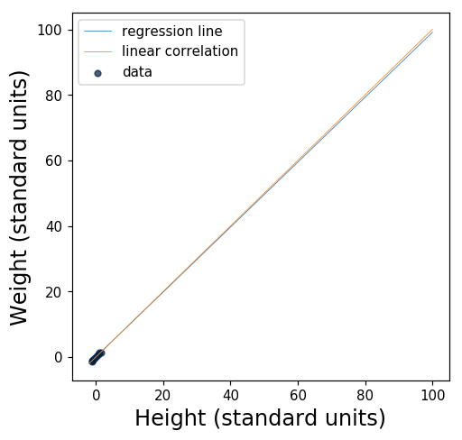
So, what do we get when we take the average of the numbers in the last column? Their average turns out to be 0.9910523777994954. Wow! That’s really close to 1. Let’s plot the regression line and see what it looks like.
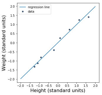
Since \(r\) is so close to 1, the regression line is awfully close to \(y = x\), a perfect linear correlation. Let’s plot that line, too.
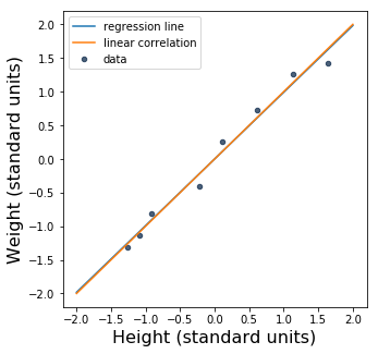
The slope of the regression line is just a hair smaller than the slope of the line \(y = x\). In fact, it’s hard to see the difference between them. Here’s a bigger version of the figure, with the ranges of the axes tweaked so that you can see that the two lines aren’t the same:
For an example of a relationship that isn’t quite as well modeled by a straight line, take a look at the Secret Bonus Content™ at the end of the accompanying notebook!
Exercise for the reader: going back to original units
Standard units are useful for finding and reasoning about the regression line, but sooner or later, we may want to convert back to original units – centimeters and kilograms, in our case. After all, we might want to be able to ask questions like, “What does our model predict Sylvia’s weight will be when she’s 80 centimeters tall?”, and it would be inconvenient to have to convert 80 to standard units first. Also, we’d probably prefer to get the answer back in kilograms rather than standard units.
The Data 8 textbook gives the following formulas for the slope and intercept of the regression line in terms of \(x\) and \(y\) in original units (where \(\mbox{SD}\) means “standard deviation”):
\[\mathbf{\mbox{slope of the regression line}} ~=~ r \cdot \frac{\mbox{SD of }y}{\mbox{SD of }x}\] \[\mathbf{\mbox{intercept of the regression line}} ~=~ \mbox{average of }y ~-~ \mbox{slope} \cdot \mbox{average of }x\]So that would make the equation of the regression line
\[y = (r \cdot \frac{\mbox{SD of }y}{\mbox{SD of }x}) \times x + (\mbox{average of }y ~-~ (r \cdot \frac{\mbox{SD of }y}{\mbox{SD of }x}) \cdot \mbox{average of }x)\]which is a lot hairier than the nice \(y = r \times x\) that you can use when working in standard units. Unfortunately, the book doesn’t actually explain how to derive the formulas for the slope and intercept. In the accompanying video at about 6m15s, Ani Adhikari shows them and then pauses for a full ten seconds before saying, “I would suggest that you don’t try to memorize this formula. Remember how the slope comes about, and then, you can, if necessary, derive the formula for the intercept, or simply – and this is our recommendation – you can look it up.” I’m not very good at following recommendations, so I ended up working it out on paper myself, and it was indeed pretty tedious, but in the end, I did manage to dervive the formulas and come up with an explanation for why they make sense. I had originally planned to write about that here, but this post is pretty long already, so perhaps that’s a post for another time.
Update (January 31, 2019): Incidentally, if you’re curious about what the remaining eleven (!) ways to look at the correlation coefficient are, I now have a follow-up post that explores another one of them!
-
This is not to say that the predictions will necessarily be good, because a straight line might not be a good fit for your data. But if you must have a straight line, then the regression line is the best straight line you can have. ↩
-
Incidentally, these were all “well-baby” checkups, not times when she was sick. She went to the doctor when she was sick a couple of times, too, but they didn’t measure her height at those appointments, only weight, so I haven’t included them here. ↩
-
Standard units are also known as standard scores, or z-scores. My impression is that the terminology “standard units” isn’t as, uh, standard as “z-scores” or “standard scores”, but I like it because I think it’s useful to think of standard units as just another unit of measurement. That’s the point of view that Brian M. Scott adopts in this fantastic answer to a question about standard units and standard deviations: “You might say that the standard deviation is a yardstick, and a z-score is a measurement expressed in terms of that yardstick.” ↩
-
I like the Data 8 definition of standard deviation: it’s the root mean square of deviations from average. Section 14.2 of the book has a detailed explanation. ↩
-
If my explanation here isn’t convincing enough, Ani Adhikari’s explanation in one of the Data 8X videos might be! ↩
Comments