
Way number eight of looking at the correlation coefficient
This post has an accompanying Jupyter Notebook!
Back in August, I wrote about how, while taking the Data 8X series of online courses1, I had learned about standard units and about how the correlation coefficient of two (one-dimensional) data sets can be thought of as either
- the slope of the linear regression line through a two-dimensional scatter plot of the two data sets when in standard units, or
- the average cross product of the two data sets when in standard units.
In fact, there are lots more ways to interpret the correlation coefficient, as Rodgers and Nicewander observed in their 1988 paper “Thirteen Ways to Look at the Correlation Coefficient”. The above two ways of interpreting it are are number three (“Correlation as Standardized Slope of the Regression Line”) and number six (“Correlation as the Mean Cross-Product of Standardized Variables2”) on Rodgers and Nicewander’s list, respectively.
But that still leaves eleven whole other ways of looking at the correlation coefficient! What about them?
I started looking through Rodgers and Nicewander’s paper, trying to figure out if I would be able to understand any of the other ways to look at the correlation coefficient. Way number eight (“Correlation as a Function of the Angle Between the Two Variable Vectors”) piqued my interest. I know what angles, functions, and vectors are! But what are “variable vectors”?
Turning our data inside out
Rodgers and Nicewander write:
The standard geometric model to portray the relationship between variables is the scatterplot. In this space, observations are plotted as points in a space defined by variable axes.
That’s the kind of thing I wrote about back in August. For instance, here’s a scatter plot showing the relationship between my daughter’s height and weight, according to measurements taken during the first year of her life. There are eight data points, each corresponding to one observation – that is, one pair of height and weight measured at a particular doctor visit.
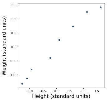
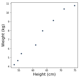
These measurements are in standard units, ranging from less than -1 (meaning less than one standard deviation below average for the data set) to near zero (meaning near average for the data set) to more than 1 (meaning more than one standard deviation above average for the data set). (If you’re not familiar with standard units, my previous post goes into detail about them.) I also have another scatter plot in centimeters and kilograms, if you’re curious.
Rodgers and Nicewander continue:
An “inside out” version of this space – usually called “person space” – can be defined by letting each axis represent an observation. This space contains two points – one for each variable – that define the endpoints of vectors in this (potentially) huge dimensional space.
…Whoooooa.
So, instead of having height and weight as axes, they want us to take each of the eight rows of our table – each observation – and make those be our axes. And the two axes we have now, height and weight, would then become points in that eight-dimensional space.
In other words, we want to take our table of data – which looks like this, where rows correspond to points and columns correspond to axes on our scatter plot –
| Date | Height (standard units) | Weight (standard units) |
|---|---|---|
| 2017-07-28 | -1.26135 | -1.3158 |
| 2017-08-07 | -1.08691 | -1.13054 |
| … | … | … |
– and turn it sideways, like this:
| Date | 2017-07-28 | 2017-08-07 | … |
|---|---|---|---|
| Height (standard units) | -1.26135 | -1.08691 | … |
| Weight (standard units) | -1.3158 | -1.13054 | … |
Now we have two points, one for each of height and weight, and eight axes, one for each of our eight observations.
Paring down to three dimensions
Eight dimensions are hard to visualize, so for simplicity’s sake, let’s pare it down to just three dimensions by picking out three observations to think about. I’ll pick the first, the last, and one in the middle. Specifically, I’ll pick the observations from when my daughter was four days old, about six months old, and about a year old:
| Date | 2017-07-28 | 2018-01-26 | 2018-07-30 |
|---|---|---|---|
| Height (standard units) | -1.26135 | 0.617255 | 1.63707 |
| Weight (standard units) | -1.3158 | 0.728253 | 1.41777 |
What do we get when we visualize this sideways data set as a three-dimensional scatter plot? Something like this:
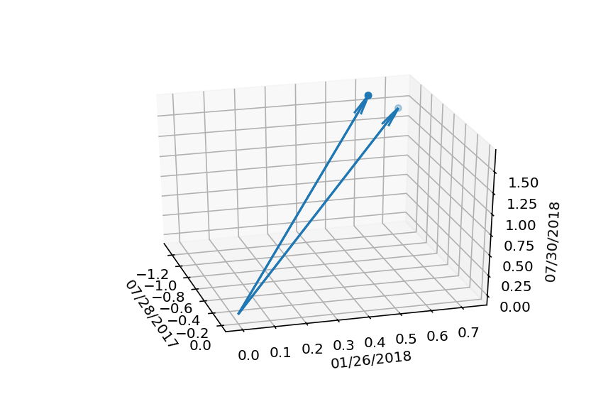
What’s going on here? We’re looking at points in “person space”, where, as Rodgers and Nicewander explain, each axis represents an observation. In this case, there are three observations, so we have three axes. And there are two points, as promised – one for each of height and weight.
If we look at the difference between the two points on the z-axis – that is, the axis for the 07/30/2018 observation – we can see that the darker-colored blue dot is higher up. It must represent the “height” variable, then, with coordinates (-1.26135, 0.617255, 1.63707). That means that the other, lighter-colored blue dot, with coordinates (-1.3158, 0.728253, 1.41777), must represent the “weight” variable.
I’ve also plotted vectors going from the origin to each of the two points, and these, finally, are what Rodgers and Nicewander mean by “variable vectors”!
The angle between variable vectors
Continuing with the paper:
If the variable vectors are based on centered variables, then the correlation has a relationship to the angle \(\alpha\) between the variable vectors (Rodgers 1982): \(r = \textrm{cos}(\alpha)\).
Oooh. Okay, so first of all, are our variable vectors “based on centered variables”? From what Google tells me, you center a variable by subtracting the mean from each value of the variable, resulting in a variable with zero mean. The variables we’re dealing with here are in standard units, and so the mean is already zero. So, they’re already centered! Hooray.
Finding the angle between [-1.26135, 0.617255, 1.63707] and [-1.3158, 0.728253, 1.41777] and taking its cosine, we can compute \(r\) to be 0.9938006245545371. Almost 1! That means that, just like last time, we have an almost perfect linear correlation.
It’s a bit different from what we got for \(r\) last time, which was 0.9910523777994954. But that’s because, for the sake of visualization, we decided to only look at three of the observations. To get more accuracy, we can go back to all eight dimensions. We may not be able to visualize them, but we can still measure the angle between them! Doing that, we get 0.9910523777994951, which is the same as we had last time, modulo 0.0000000000000003 worth of numerical imprecision. I’ll take it.
So, that’s way number eight of looking at the correlation coefficient – as the angle between two variable vectors in “person space”!
By any other name
Why do Rodgers and Nicewander call it “person space”? I wonder if it’s because it’s common in statistics for an observation – a row in our original table – to correspond to a single person. It seems to also sometimes be called “subject space”, “observation space”, or “vector space”. For instance, here’s a stats.SE answer that shows an example contrasting “variable space” – that is, the usual kind of scatter plot, with an axis for each variable – with “subject space”.
I had never heard any of these terms before I saw Rodgers and Nicewander’s paper, but apparently it’s not just me! A 2002 paper by Chong et al. in the Journal of Statistics Education laments that the concept of subject space (as opposed to variable space) often isn’t taught:
There are many common misconceptions regarding factor analysis. For example, students do not know that vectors representing latent factors rotate in subject space, rather than in variable space. Consequently, eigenvectors are misunderstood as regression lines, and data points representing variables are misperceived as data points depicting observations. The topic of subject space is omitted by many statistics textbooks, and indeed it is a very difficult concept to illustrate.
And the lack of uniform terminology seems to be part of the problem. Chong et al. get delightfully snarky in their discussion of this:
In addition, the only text reviewed explaining factor analysis in terms of variable space and vector space is Applied Factor Analysis in the Natural Sciences by Reyment and Joreskog (1993). No other textbook reviewed uses the terms “subject space” or “person space.” Instead vectors are presented in “Euclidean space” (Joreskog and Sorbom 1979), “Cartesian coordinate space” (Gorsuch 1983), “factor space” (Comrey and Lee 1992; Reese and Lochmüller 1998), and “n-dimensional space” (Krus 1998). The first two phrases do not adequately distinguish vector space from variable space. A scatterplot representing variable space is also a Euclidean space or a Cartesian coordinate space. The third is tautological. Stating that factors are in factor space may be compared to stating that Americans are in America.
For their part, Rodgers and Nicewander want to encourage more people to use this angle-between-variable-vectors interpretation of \(r\). They write:
Visually, it is much easier to view the correlation by observing an angle than by looking at how points cluster about the regression line. In our opinion, this interpretation is by far the easiest way to “see” the size of the correlation, since one can directly observe the size of an angle between two vectors. This inside-out space that allows \(r\) to be represented as the cosine of an angle is relatively neglected as an interpretational tool, however.
I have mixed feelings about this. On the one hand, yeah, it’s easier to just look at one angle between two vectors in observation space (or person space, or vector space, or subject space, or whatever you want to call it) than to have to squint at a whole bunch of points in variable space. On the other hand, for most of us it probably feels pretty strange to have, say, a “July 28, 2017” axis instead of a “height” axis. Moreover, the observation space is really hard to visualize once you get past three dimensions, so it’s hard to blame people for not wanting to think about it. I can visualize lots of points, but only a few axes, so using axes to represent observations (which we may have quite a lot of) and points to represent variables (which, when dealing with bivariate correlation, we have two of) seems like a rather backwards use of my cognitive resources! Nevertheless, I’m sure there are times when this approach is handy.
-
Since August, I finished the final course in the Data 8X sequence and am now a proud haver of the <airquotes>Foundations of Data Science Professional Certificate<airquotes> from <airquotes>BerkeleyX<airquotes>. ↩
-
When Rodgers and Nicewander speak of a “variable”, they mean it in the statistician’s sense, meaning something like “feature” (like “height” or “width”), not in the computer scientist’s sense. This is an unfortunate terminology overlap. ↩
Comments